 print
printWhat Junior Primary Font Does PLD Recommend?
At PLD we advocate for the use of a foundation font when learning to read, spell and write. Based on our experience across the disciplines of speech pathology, occupational therapy and education, and our research into this area, we believe that the use of a foundation font gives students the best opportunity to establish confidence in literacy and fine motor skills allowing them to gradually develop speed and their own style.
We do, however, appreciate that some schools choose to use a cursive font and so also have options that cater to these requirements. Please get in touch via the Expression of Interest form and we will be in touch to discuss these with you.

Whichever font you choose, we recommend that schools are consistent and explicit in their teaching to achieve the best results (Louden, 2015).
Foundation vs Cursive Font – The Research
Fine Motor Skills & Writing Font
PLD continues to review the research in this area. As it stands, the current research has yet to provide clear high-quality consensus on the best approach. However, the research that we have been able to source on this topic is summarised below. In addition to these research-based findings, we integrate practical suggestions from experts in the field including speech pathologists, literacy consultants and occupational therapists working intensively with children in this area.
Useful Themes From the Limited Research Base:
Embedding handwriting with reading and spelling improves outcomes: Embedding handwriting into structured and systematic spelling and reading instruction has led to enhanced literacy development when compared to handwriting taught in isolation (Wolf et al., 2017). Neuroimaging of the brain also demonstrates that the brain uses a shared network for reading that also handles the visual and motor aspects of writing (Nakamura et al., 2012). Therefore, the most efficient and effective use of literacy instruction involves teaching both reading and spelling together.
Timing and developmental readiness: Research indicates that children under the age of eight may struggle to master both foundation and cursive handwriting due to their developing visuomotor skills (Contreras-Vidal et al., 2005). When cursive writing is taught to beginning readers and spellers they must master a minimum of four representations of each letter (upper and lowercase foundation and cursive). Younger children are still learning to create stable internal representations of hand movements, making it harder for them to learn multiple representations of each letter. Therefore, some research suggests delaying cursive instruction until after foundation writing is well-established (Wolf et al., 2017).
Cursive vs. foundation in reading and spelling outcomes: Findings are mixed in this area with some research suggesting cursive handwriting can improve certain outcomes in some students. However, some research has found that foundation is more easily read than cursive with both adults and children showing slower word recognition and less accuracy when reading cursive font (Danna et al., 2018). Moreover, despite the educational theories suggesting cursive writing is more efficient Berninger and colleagues (2006) found that across Year 1-5 students cursive writing was consistently less accurate and slower. These findings suggest introducing cursive too early may add unnecessary complexity, slowing down reading and spelling acquisition.
Practical Perspectives from Speech Pathologists, Literacy Consultants and Occupational Therapists
Many of the studies which compare cursive writing to foundation handwriting exclude student populations which have a diagnosed disability. Therefore, we can only draw on the experiences of those who work with these populations to inform support at schools.
This quotation below, by Hugo Kerr (author of ‘The Cognitive Psychology of Literacy Teaching’), makes conclusions about the unnecessary load cursive may pose to struggling readers and writers.
“All the [children] I see are at basic level and all religiously join up their letters, at great cost in my view. The cognitive effort involved in joining up is obviously large and also obviously reduces capacity to think…adding a large and difficult cognitive task, like cursive writing, to an already rather difficult task in a highly competitive environment is a costly affair, especially for the weaker students.
“It seems to me very clear that [children’s] writing behaviours show them struggling very considerably with joining up their letters per se. A great deal of their sometimes limited capacity for concentration seems to be directed at that fiddly, effortful and (to me) rather unnatural motor aspect of spelling… Bear in mind these are the weaker readers, so they are wide open to demotivation, not to say humiliation, faced with these complicated squiggles, so ridiculous when considered in detail”.
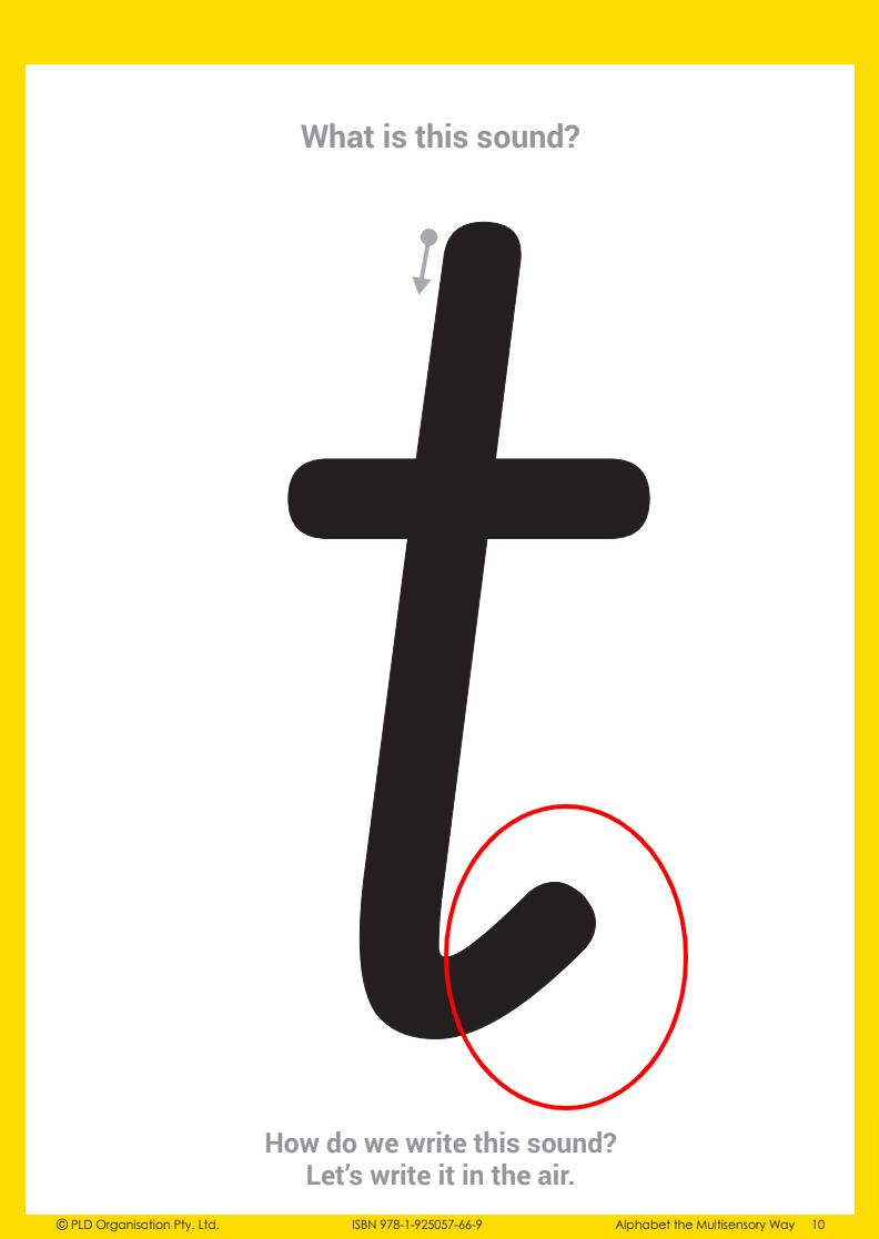
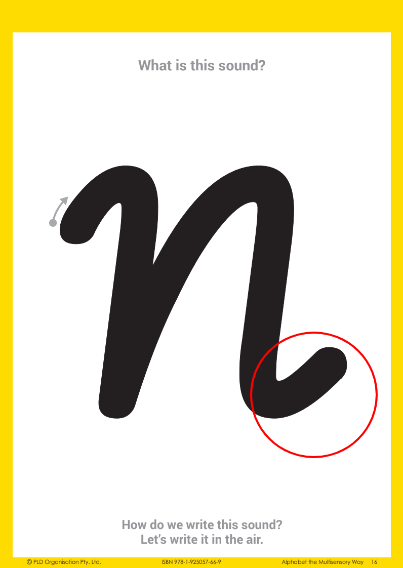
Although there is still some debate regarding the fine motor skills involved in foundation and cursive styles, the research and many Occupational Therapists agree that cursive writing font requires greater motor coordination and complexity of letter formation. With a foundation writing font each letter is isolated, its shape stable and the pen lifts between letters allowing planning time, whereas cursive writing font is more difficult to master (Poudou, 2018; Bara & Morin, 2013).
Occupational Therapists explain that a cursive tick (that is the final aspect of letter formation in cursive writing fonts) is quite a mature controlled movement and often an inappropriate expectation for young students. What you will frequently observe is young students finishing letters with a large or elongated tick, rather than finishing letter formation with a small and controlled tick. You may also observe students forming the letter and then after taking their pencil off the page adding the cursive tick onto the end of letters in a secondary movement.
Hence from an Occupational Therapists’ point of view, foundation writing font is recommended, as introducing cursive writing font too early will challenge students and may result in a negative impact on their posture and pencil grip.
Literacy Perspective & Writing Font
Most text and educational support resources that students use in the classroom are presented in print. Print writing fonts are more closely related to foundation writing fonts, rather than cursive script.
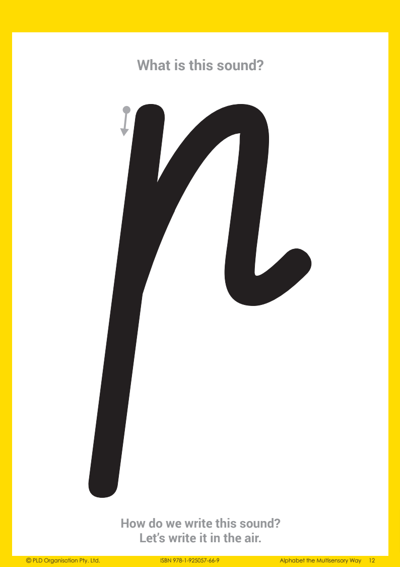
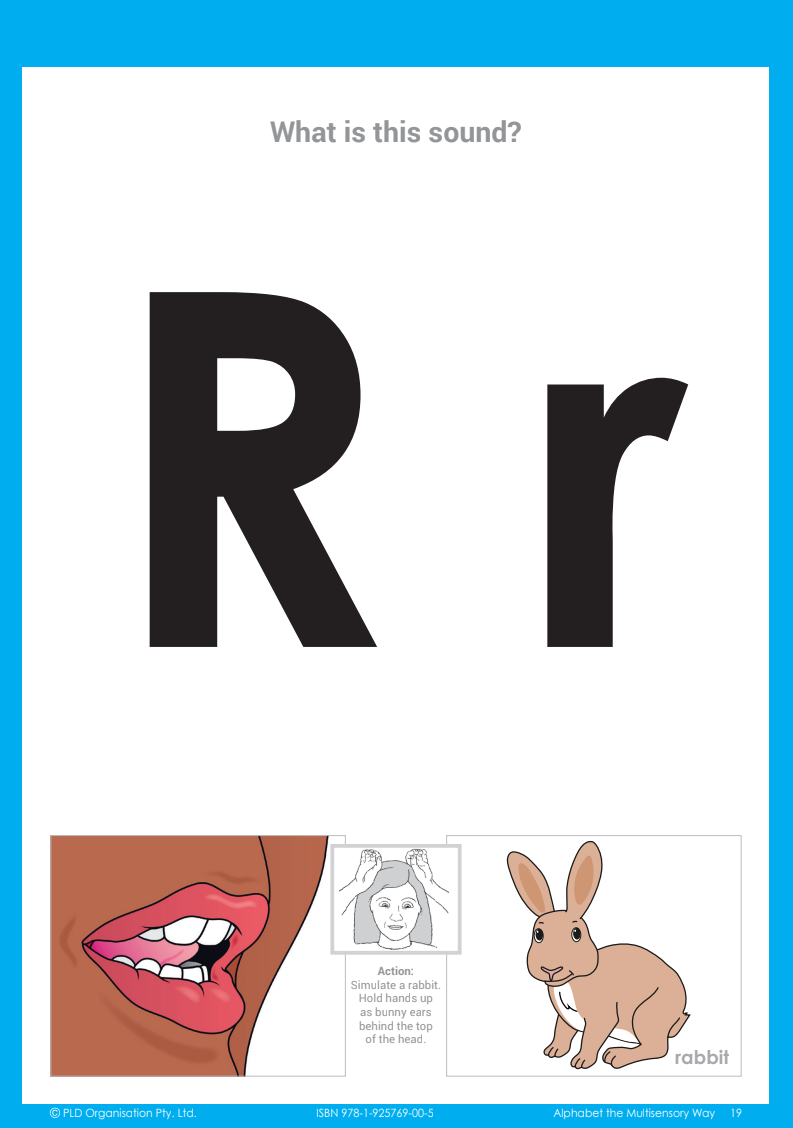
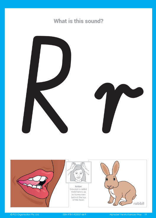
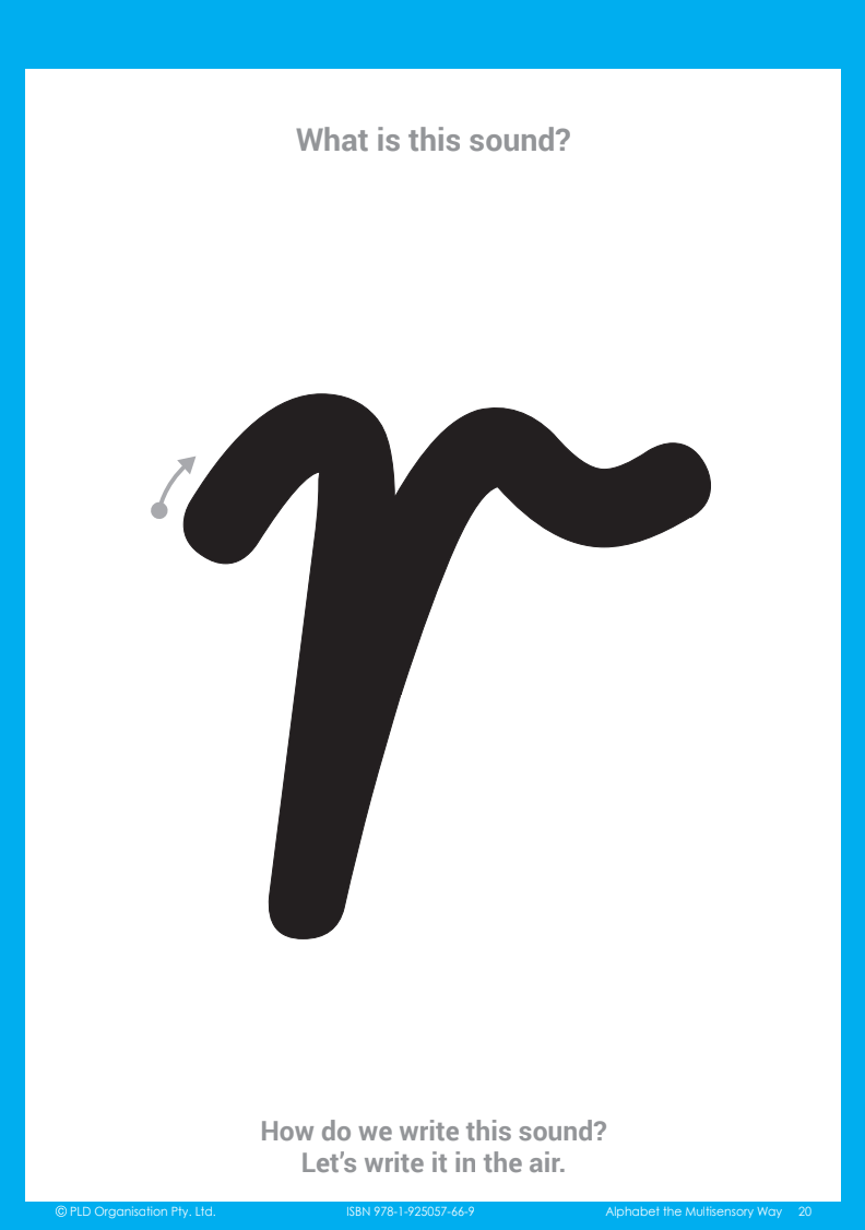
From a literacy point of view, this can add complexity for young students. We are asking them to master both a reading font (typically a foundation font), AND a spelling and writing font (cursive). This complexity is amplified when dealing with certain letters (e.g. p, r, and b) as their shapes vary significantly between foundation fonts and cursive writing fonts.
Additionally, the research suggests that cursive font is more difficult to read (Danna et al., 2018). Each letter is connected to the next in a word, so students have to not only form the letter but consider what letter is coming next so they can join them correctly.
By using foundation font as a consistent text across reading, writing and spelling, it simplifies the start of their literacy journey.
Speed and Automaticity of Writing
When we teach handwriting, our ultimate goal is for students to automate their handwriting so they can write with speed and accuracy and focus on the task of sharing their ideas through written composition.
What’s interesting is that the research is inconclusive as to whether this speed and automaticity is best achieved with either foundation or cursive. In fact, much of the research is reluctant to recommend one style of handwriting over another. However recent studies of older primary students have shown a mixed style of foundation and cursive is faster and equally legible as either cursive or foundation (Bara & Morin, 2013).
As Bara and Morin (p.614) concluded, students will eventually develop their own style often combining letters from different writing styles and perhaps teachers should not “insist on a strict adherence to a particular model.” Professor of Education Psychology at the University of Washington, Virginia Berninger suggests “evidence supports teaching both formats of handwriting and then letting each student choose which works best for him or her” (2012, p.31).
PLD’s Letter Formation Range
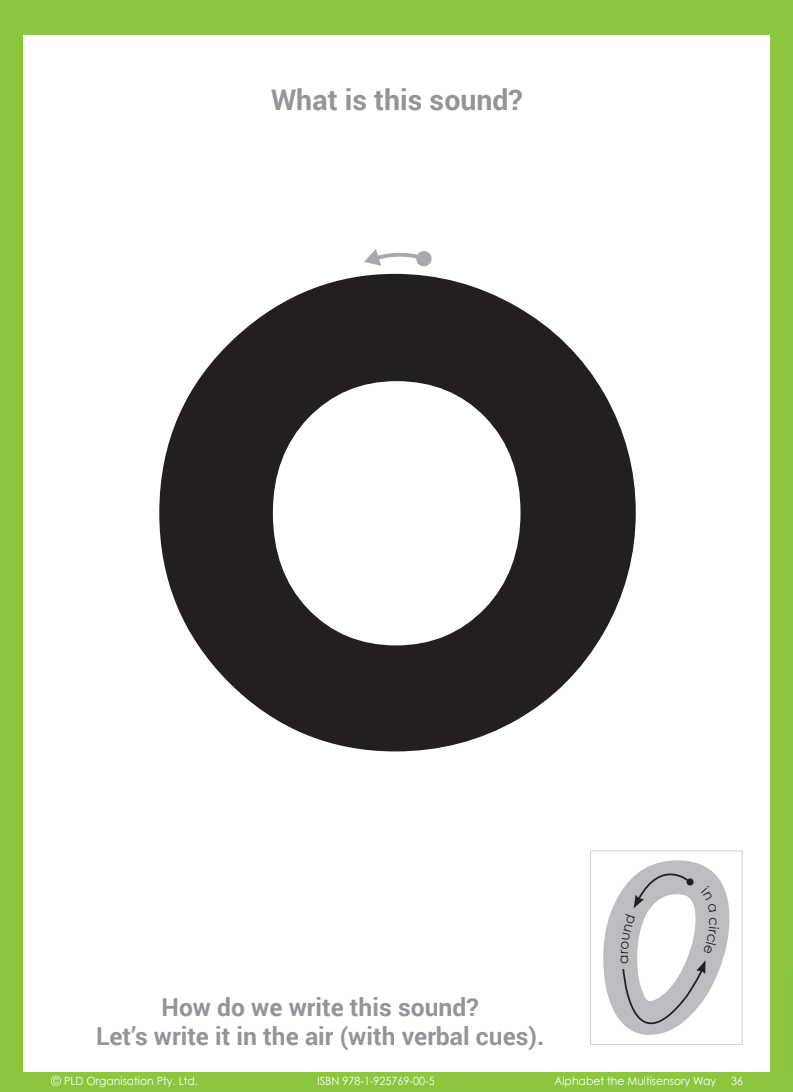
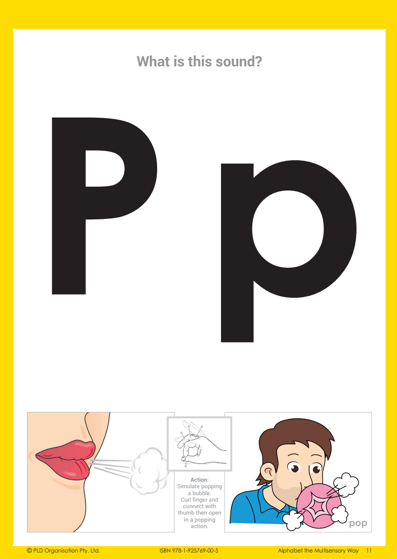
Our Letter Formation range (covering Early Years to Year 1) has been developed using a NSW Foundation Font, but includes letter variations for k and v within the appendix, as well as blank pages to allow teachers to apply other font variations.
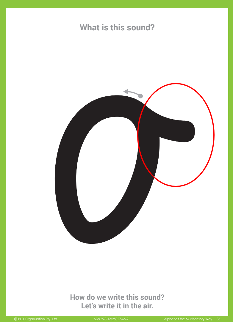
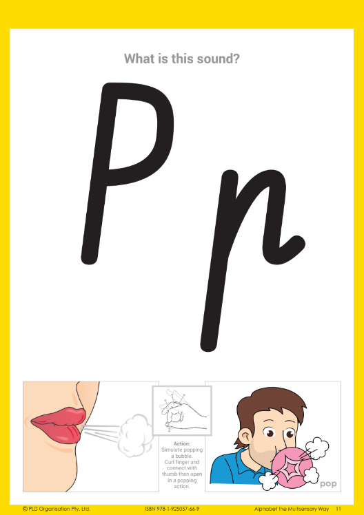
In support of schools still using a cursive font, some of PLD’s programs are also available in a Victorian Cursive Font. However, our recommendation is always that schools plan to move away from a cursive font in the junior primary years for the reasons outlined in this blog.
-
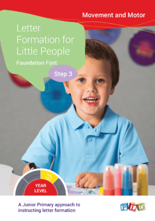
 Letter Formation for Little People – Foundation Font – Step 3$82.50$82.50 incl. GST
 -
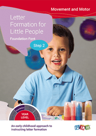
Letter Formation for Little People – Foundation Font – Step 2$82.50$82.50 incl. GST
-
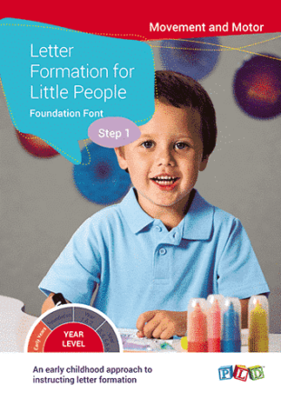
Letter Formation for Little People – Foundation Font – Step 1$82.50$82.50 incl. GST
-
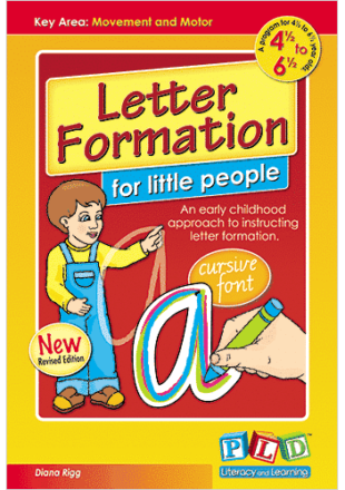
Letter Formation for Little People – Cursive Font$82.50
PLD Underpins High-Performance
The 2015 Department of Education Western Australia study, conducted by Professor William Louden, selected nine top-performing schools based on their NAPLAN results and reviewed their processes. The report, “High Performing Primary Schools: What do they have in common?” noted that key characteristics included lower variation in teaching methods and the use of explicit teaching strategies for teaching phonological awareness and phonics. Among the mandated resources utilised within these schools were synthetic phonics resources. PLD programs were commonly used in the schools investigated. Professor Louden found that high-performing schools used explicit teaching strategies for teaching phonological awareness and phonics through a Structured Synthetic Phonics (SSP) program.
Reference List:
Bara, F. & Morin, M. (2013). “Does the Handwriting Style Learned in First Grade Determine the Style Used in the Fourth and Fifth Grades and Influence Handwriting Speed and Quality? A Comparison between French and Quebec Children.” Psychology in the Schools: 50(6), 601-617.
Berninger, V. W. (2012). “Strengthening the Mind’s Eye. The Case for Continued Handwriting Instruction in the 21st Century.” Principal: May/June, 28-31.
Berninger, V. W., Abbott, R. D., Jones, J., Wolf, B. J., Gould, L., Anderson-Youngstrom, M., … & Apel, K. (2006). “Early development of language by hand: Composing, reading, listening, and speaking connections; three letter-writing modes; and fast mapping in spelling.” Developmental Neuropsychology, 29(1), 61-92.
Contreras-Vidal, J. L., Bo, J., Boudreau, J. P., & Clark, J. E. (2005). Development of visuomotor representations for hand movement in young children. Experimental Brain Research: 162, 155-164.
Danna, J., Massendari, D., Furnari, B., & Ducrot, S. (2018). “The optimal viewing position effect in printed versus cursive words: Evidence of a reading cost for the cursive font.” Acta Psychologica: 188, 110-121.
Didau, D. (2014, May 29). “The curse of cursive: Fetishising joined-up writing.” Learning Spy. https://learningspy.co.uk/literacy/curse-cursive-fetishising-joined-writing/
Louden, W. (2015). “High performing primary schools: What do they have in common.” Retrieved from Department of Education Western Australia. Retrieved from https://crackingtheabccode.com/wp-content/uploads/2014/06/High-performing-schools-in-WA-v4.0.pdf
Nakamura, K., Kuo, W. J., Pegado, F., Cohen, L., Tzeng, O. J., & Dehaene, S. (2012). “Universal brain systems for recognizing word shapes and handwriting gestures during reading.” Proceedings of the National Academy of Sciences: 109(50), 20762-20767.
Poudou, M. T. Z. (2018, May 1). “Cursive Writing and Script Writing.” Teachers’ Hub.
Wolf, B., Abbott, R. D., & Berninger, V. W. (2017). “Effective beginning handwriting instruction: Multi-modal, consistent format for 2 years, and linked to spelling and composing.’ Reading and Writing: 30, 299-317.